

Portal Branding
Make the documentation portal yours by choosing a theme, setting brand colors and fonts, uploading your logo and favicon, and layering on custom CSS. All branding applies to the published portal and is configured per documentation portal.
Open Documentation Settings → Public Portal → Appearance and click Open Theme Editor in the Theming card. The Appearance tab only appears once the portal is enabled, as does every tab but Publish. The editor is split-screen, with settings on the left and a live preview on the right that updates as you change values. Click Save in the header to apply, and changes take effect on the next portal build.
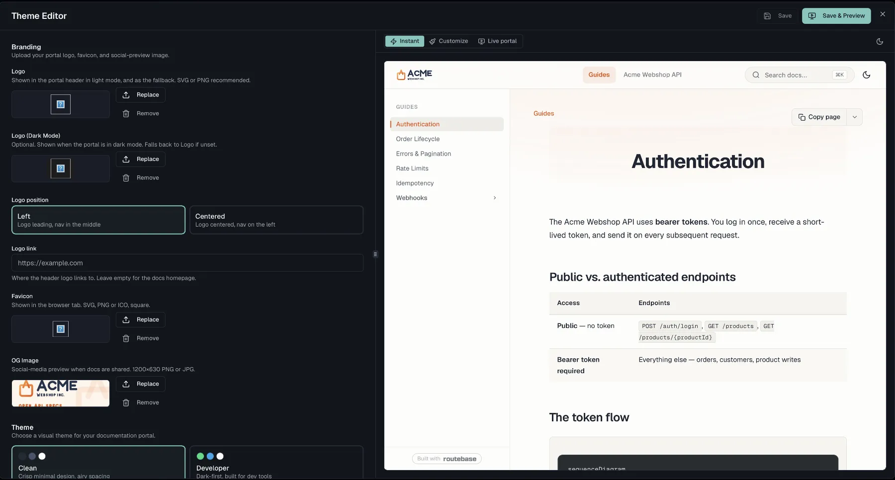
Branding assets
The Branding section uploads your portal identity assets. Each asset has Upload or Replace and Remove buttons with an inline preview:
| Asset | Guidance |
|---|---|
| Logo | Shown in the portal header in light mode, and as the fallback. SVG or PNG recommended. |
| Logo (Dark Mode) | Optional. Shown when the portal is in dark mode. Falls back to Logo if unset. |
| Favicon | Shown in the browser tab. SVG, PNG or ICO, square. |
| OG Image | Social-media preview when docs are shared. 1200×630 PNG or JPG. |
The same section also sets two header options:
- Logo position offers Left, which puts the logo leading with the nav in the middle, or Centered, which centers the logo and moves the nav to the left.
- Logo link sets where the header logo links to. Leave it empty for the docs homepage.
Themes
Pick one of nine pre-built themes, and each swatch shows its primary, accent and background colors:
| Theme | Style |
|---|---|
| Clean | Crisp minimal design, airy spacing |
| Developer | Dark-first, built for dev tools |
| Enterprise | Corporate, structured layout |
| Modern | Playful with gradients |
| Classic | Traditional docs, serif body text |
| Clay | Warm terracotta on cream |
| Routebase | Slate × Sage brand theme |
| Maple | Warm paper tones, amber accent |
| Mono | Monochrome minimalism, ink on white |
Layout
- API Navigation decides how a spec's reference is split into pages. Per endpoint is the default and gives one page per endpoint, Per folder gives one page per tag or folder with stacked endpoints, and Single page puts the whole spec on one scrollable page. Choosing Per folder reveals a Folder landing option of Endpoint overview list or Folder description only, which decides what each folder page shows above its endpoints. A Previous / next links switch adds reading-order navigation at the end of API pages.
- Layout Width offers Centered, a fixed-width column with side whitespace, or Full width, which puts navigation on the far left and the "on this page" list on the far right.
- Page Eyebrow decides what appears above each page title, either Section for the parent group name or Breadcrumbs for the full breadcrumb trail with links.
Custom colors
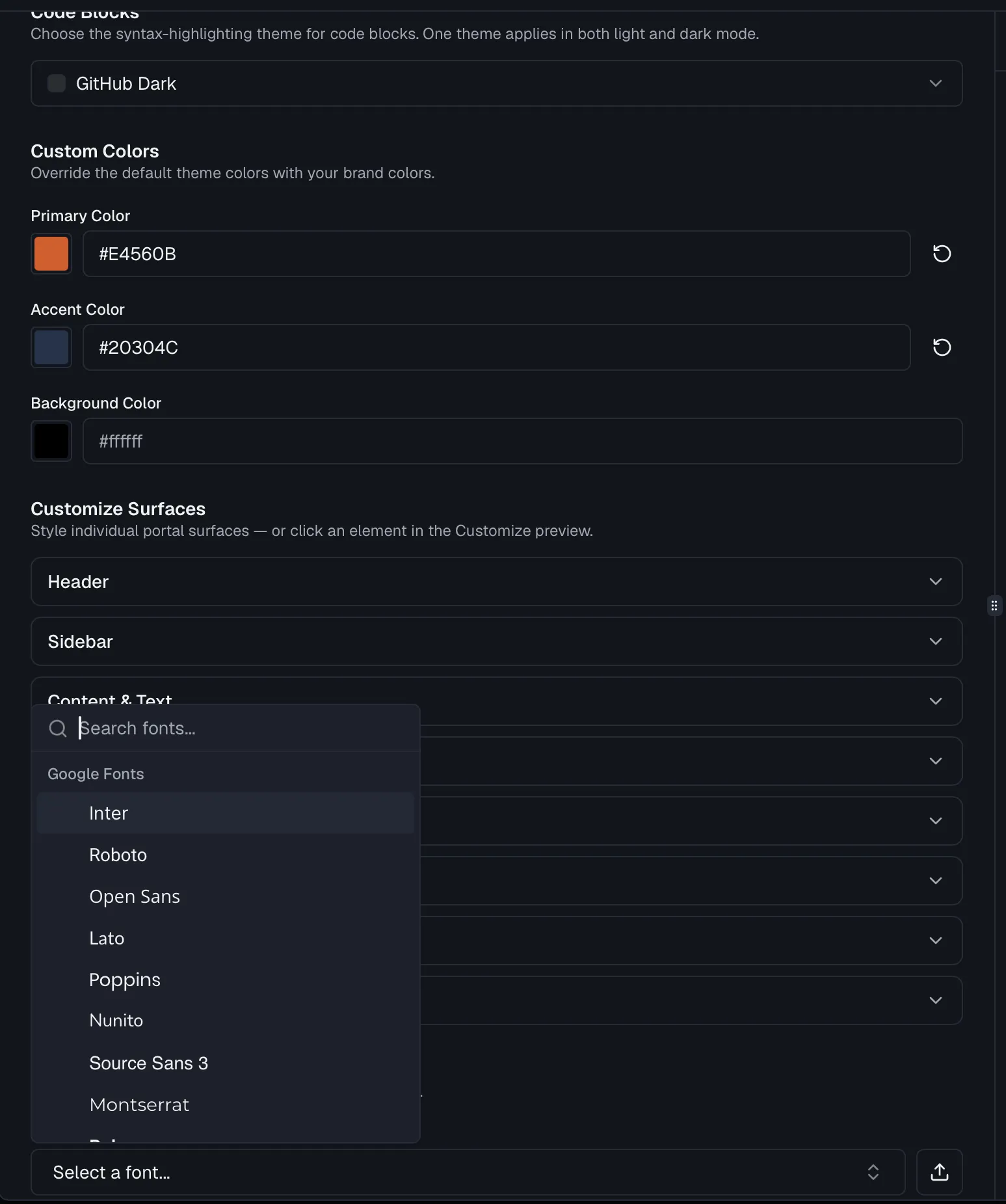
Override the theme's Primary Color, Accent Color and Background Color with your brand palette. Enter a 3-digit or 6-digit hex value, or use the color picker, and a reset button returns each color to the theme default. Leaving a field empty keeps the theme's own color.
Background
Add a subtle decorative background to the portal pages by choosing a Background decoration. None leaves a plain background color, Gradient adds a soft primary glow from the top, Grid draws a subtle blueprint line grid, and Windows shows diagonal glass panes. You can also upload a full-page Background Image, with an optional Background Image (Dark Mode) variant, and an uploaded image takes precedence over the decoration.
Code Blocks
Choose the syntax-highlighting theme for code blocks from a curated set, where each option shows a color swatch. One theme applies in both light and dark mode.
Typography
Two font slots each carry a searchable Google Fonts picker and a live font preview:
- Body Font sets the body typeface, and the choices include Inter, Roboto, Open Sans, Lato, Poppins, Montserrat and DM Sans.
- Code Font Family sets the monospace font for code, with choices such as JetBrains Mono, Fira Code, Source Code Pro and IBM Plex Mono.
A Body Weight selector sets the body text weight, from Light through Extrabold, or Theme default.
To use your own typeface, click the upload button next to either picker and add a custom WOFF2 font. It replaces the Google Font selection until you remove it. Choose Use theme default in the picker to clear a selection.
Headings
Headings can take their own Heading Font and Heading Weight, both defaulting to the body font and weight.
Font Size
Two sliders scale text independently. Base Text Size runs from 12 to 22 px, and Heading Scale runs from 75 to 150%. Each shows Default until you move it, and a reset control returns it to the theme default.
Customize Surfaces
Beyond the theme-wide colors, the Customize Surfaces section styles individual portal surfaces such as headers, sidebars and cards, with per-surface and per-property overrides for light and dark mode. You can expand a surface group to edit it directly, or click an element in the Customize preview on the right to jump straight to its controls.
Dark mode
The Enable dark mode switch turns on a dark appearance for the portal. When it is on, two more controls appear:
- Show the light/dark toggle decides whether readers get a toggle to switch appearance themselves. Turn it off for a strict single-appearance portal.
- Default appearance offers Match system, Light or Dark. With the toggle shown, this is what first-time visitors see before they switch, and with the toggle hidden it is the appearance every visitor gets.
The theme editor preview lets you check both modes before saving.
Custom CSS
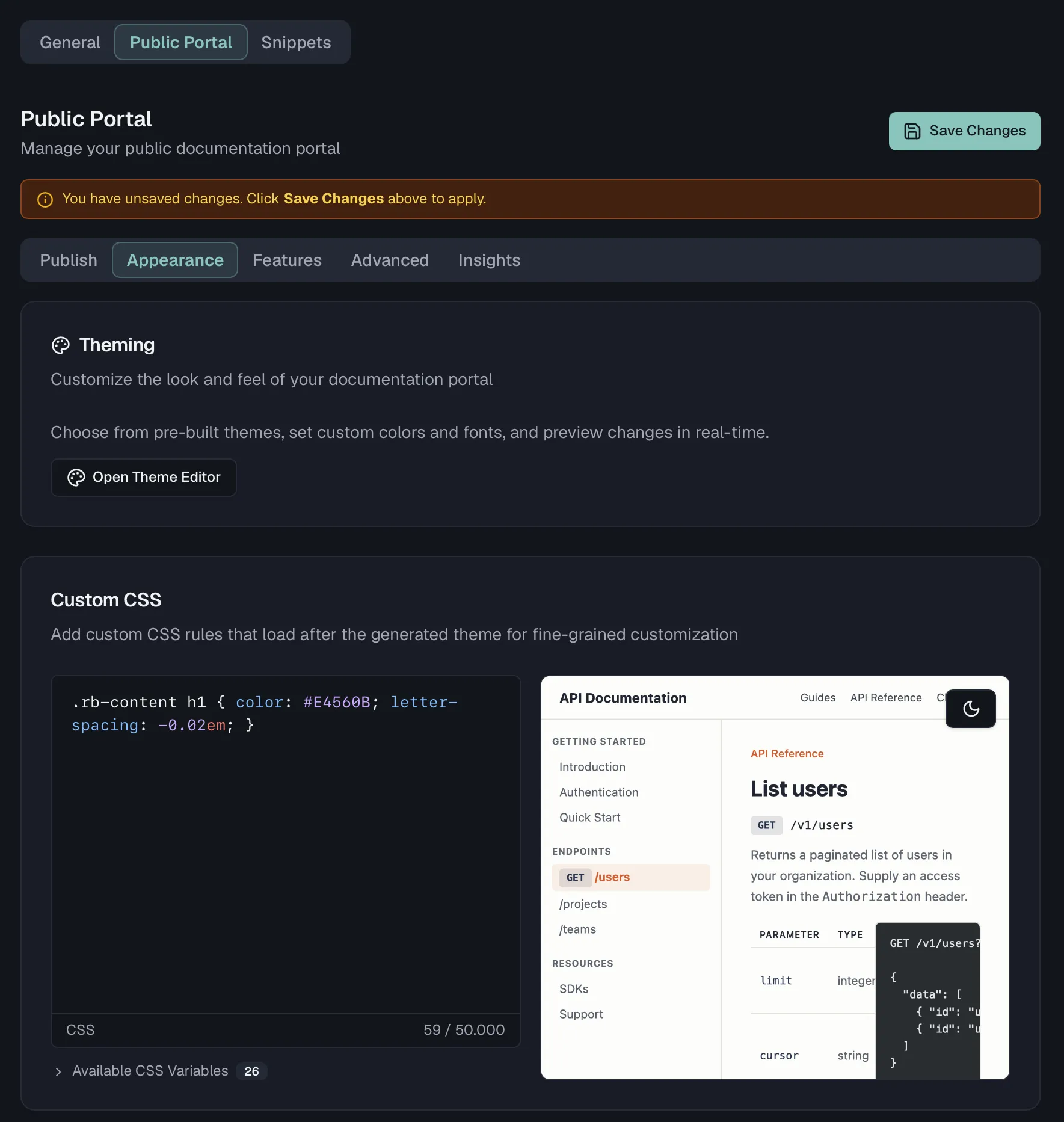
For fine-grained control beyond the theme editor, use the Custom CSS card on Documentation Settings → Public Portal → Appearance. It sits directly below Theming, with a live preview of your rules beside the editor. The editor has CSS syntax highlighting, a character limit of 50,000, and warnings for potentially problematic selectors. It also carries a built-in reference of the portal's CSS variables, grouped into colors such as --rb-primary, --rb-background and --rb-text, layout such as --rb-header-bg and --rb-sidebar-bg, and typography such as --rb-font-family and --rb-code-font-family. Your rules load after the generated theme, so they win specificity ties.
Removing the Routebase footer
On the Pro plan and above, the Hide Routebase Branding toggle on Public Portal → Features removes the "Powered by Routebase" footer from your portal.
Custom domains
You can serve the portal on a domain you own. The Custom Domain card on Public Portal → Publish, directly below the portal subdomain, walks you through entering your domain, adding the CNAME and TXT DNS records, verifying DNS and provisioning an SSL certificate. Once the domain is active, it also monitors DNS and SSL health. Custom domains are a Pro and Enterprise feature, and Custom Domains covers the full setup. Without a custom domain, your portal is served on its portal subdomain.
Related
- Publishing — subdomain, builds, and portal features
- Custom Domains — serving the portal on your own domain
- Documentation Overview — structuring the content the theme renders