

Authoring Pages
Documentation pages are written in a block-based rich text editor with Markdown support, slash commands, drag-and-drop blocks and real-time collaboration. Everything in this guide applies to pages in Draft or In Review versions, because live and archived versions open in read-only mode.
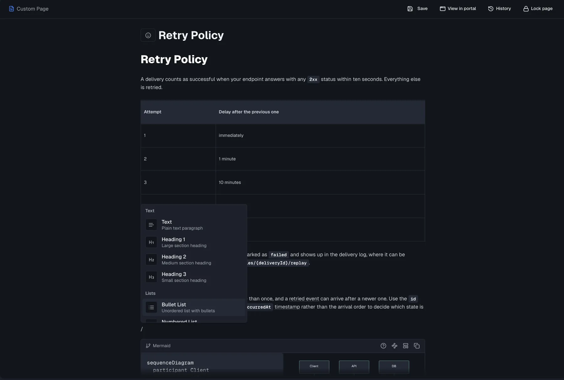
The page header
A thin bar above the content area carries the page type label on the left, reading Custom Page or Getting Started and so on, with the page actions on the right:
- Presence avatars show teammates currently in the page, alongside a save indicator and a Save button while there are unsaved edits. Changes auto-save as you type, and if you try to navigate away with unsaved changes, Routebase asks before discarding them.
- View in portal opens a portal-faithful preview of the page.
- History opens the page's revision history, described under Page history below.
- Lock page makes the page read-only for everyone until someone unlocks it, as covered under Real-time collaboration. It requires docs:write and is hidden on read-only versions.
- Changelog pages additionally show a Generate button, which Changelog explains.
The title and the emoji icon picker are not in that bar. They sit at the top of the content column itself and scroll with the text, the way the published page renders them. The icon appears next to the page in the tree and in portal navigation. New pages focus the title automatically so you can rename immediately.
The quiet editor
Documentation pages use a deliberately quiet editor, with no card border, no background and no toolbar at rest. The toolbar fades in as soon as the editor has focus and fades back out when you click away. A page you are only reading therefore looks like the published page rather than like a form. The placeholder text behaves the same way, appearing only while the editor is focused.
One consequence is worth knowing. The quiet editor has no status bar, so documentation pages show no live word or character count.
Rich and Markdown modes
The toolbar's Rich / Markdown toggle switches between WYSIWYG editing and raw Markdown. The content converts in both directions, so you can paste Markdown from elsewhere and then fine-tune visually. In Markdown mode, the toolbar shows "Markdown Mode - Use syntax for formatting" and formatting buttons are disabled.
Toolbar and formatting
In rich mode the toolbar offers these actions, with their keyboard shortcuts:
| Group | Actions |
|---|---|
| History | Undo (⌘Z), Redo (⌘⇧Z) |
| Headings | Heading 1–3 (⌘⌥1–3) |
| Text | Bold (⌘B), Italic (⌘I), Strikethrough (⌘⇧X), Inline Code (⌘E) |
| Lists | Bullet List (⌘⇧8), Numbered List (⌘⇧7), Task List (⌘⇧9) |
| Blocks | Blockquote (⌘⇧B), Horizontal Rule |
| Insert | Link (⌘K), Tooltip, Badge, Image, Table (3×3 with header row) |
Two of the Insert buttons are inline marks rather than blocks, so they have no slash command and you apply them to selected text:
- Tooltip prompts for the tip text and wraps the selection, and readers see the explanation on hover in the published portal. Submitting an empty tip removes the mark again.
- Badge turns the selection into a small pill. The toolbar button applies the neutral variant, and you switch it to info, success, warning or error from the bubble menu.
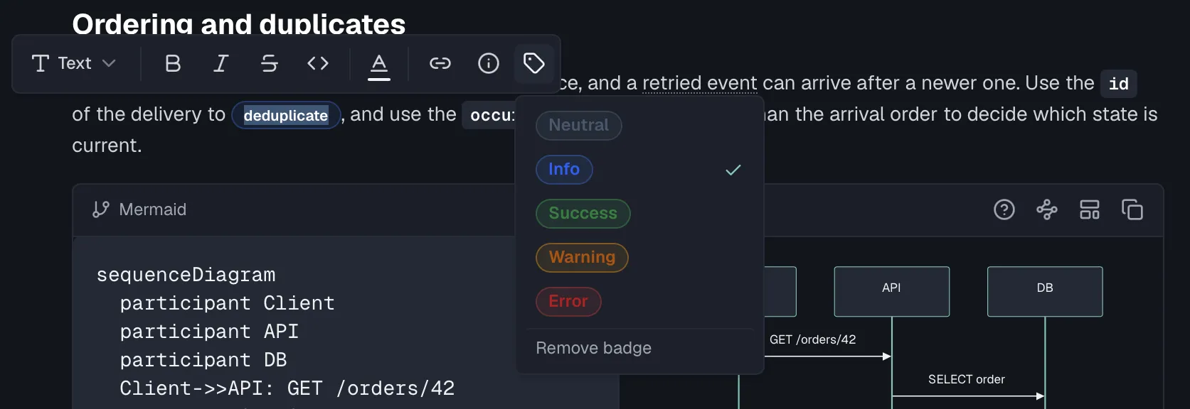
The bubble menu
Selecting text pops up a floating menu with:
- Turn into converts the current block to Text, Heading 1 to 3, Quote, Callout, Bullet List or Numbered List.
- Toggles for Bold, Italic, Strikethrough and Inline Code.
- A color picker with text colors and highlight colors, offering Default, Gray, Brown, Orange, Yellow, Green, Blue, Purple, Pink and Red.
- A link dialog that lets you set the URL and display text.
- A badge picker, shown on badged text, for switching between the five variants.
Block handles
Hovering a block reveals a Notion-style handle with a + button to insert a block and a grip to drag blocks to a new position.
Slash commands
Type / on an empty line, or anywhere in a paragraph, to open the command menu. It filters as you type and is grouped as follows:
| Group | Commands |
|---|---|
| Text | Text, Heading 1, Heading 2, Heading 3 |
| Lists | Bullet List, Numbered List, Task List |
| Blocks | Code Block (syntax highlighted), Quote, Divider |
| Media | Table, Image, Frame, Link |
| Components | Mermaid Diagram, Sequence Diagram, ER Diagram, State Diagram, Callout, Info, Warning, Tip, Error, Tabs, Code Group, Steps, Accordion, Toggle, Icon, Columns, Update, Card Grid, Diagram from API Data, Snippet |
The documentation components are purpose-built for API docs:
- Mermaid Diagram inserts a Mermaid-syntax diagram block, covered under Diagrams below. Sequence Diagram, ER Diagram and State Diagram insert the same block pre-seeded with the matching template.
- Callout inserts an info, warning, error or tip box. The Info, Warning, Tip and Error commands insert the matching variant directly.
- Tabs inserts tabbed content sections.
- Code Group holds one code example in multiple languages, rendered as language tabs.
- Steps inserts a numbered step-by-step guide.
- Accordion inserts collapsible FAQ or details sections.
- Toggle inserts a single collapsible content section.
- Icon places an inline icon in running text.
- Columns creates a side-by-side layout for any content.
- Update inserts a changelog entry with a label and anchor.
- Card Grid builds a grid of linked cards, which suits "next steps" navigation.
- Diagram from API Data generates a diagram from your endpoints or schemas.
- Snippet inserts a reusable content snippet.
In the Media group, Frame inserts a framed image with a caption, and Image opens a dialog with upload, drag-and-drop and URL tabs, covered under Images below.
Diagrams
A Mermaid block is split in two. You type the diagram source on the left and a live preview renders on the right, stacked on narrow screens, re-rendering shortly after you stop typing. Nothing has to be saved or published to see the result.
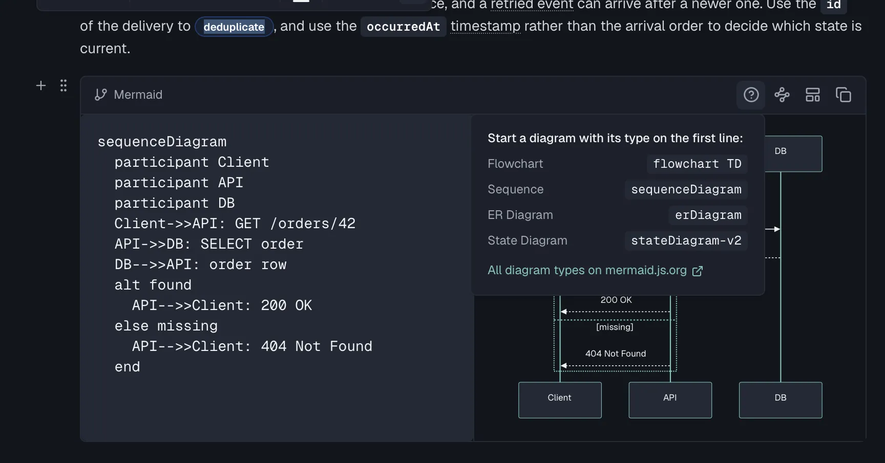
Three aids sit in the block's own toolbar:
- Syntax help opens a popover with the opening line for each diagram type, so
flowchart TD,sequenceDiagram,erDiagramandstateDiagram-v2, plus a link to mermaid.js.org for everything else. - Insert template replaces the source with a worked starting point for Flowchart, Sequence, ER Diagram or State Diagram. If you have already edited the block, Routebase asks before overwriting it.
- Generate from API data opens the same dialog as the Diagram from API Data slash command, targeted at this block.
When the source does not parse, the preview is replaced by a Diagram syntax error panel. Above the raw Mermaid message it puts a plain-language hint for the common mistakes. Those are a missing diagram type on the first line, -> where a flowchart needs -->, and an unclosed bracket or quote.
How diagrams are themed on the published portal, how to style an individual diagram, and where else Mermaid renders is covered in Diagrams.
Images
There are three ways to add images:
- Toolbar → Image opens the Insert Image dialog with Upload and URL tabs. Uploads accept PNG, JPG, GIF, WebP and SVG up to 5 MB, and an optional Alt Text field covers accessibility.
- Drag and drop an image file straight into the editor.
- Paste an image from the clipboard.
Uploaded images are stored by Routebase and inserted by URL, so they survive portal builds and load fast for readers.
Display width
By default an image fills the content column, which is a lot of page for a tall, narrow screenshot. Click an image to select it and pick 25%, 50%, 75% or 100% from the control in its lower-left corner. The percentage is a cap on the content column's width, so a small image is never blown up past its own size, and the image keeps its aspect ratio in both themes.
The width is stored as a class on the image, so you can also write it by hand in the Markdown tab, or in a page you keep in your own repository:
<img src="/assets/images/signup.png" alt="The signup form" class="docs-img docs-img--w50">For a light/dark screenshot pair, put the same modifier on both variants:
<img src="/assets/images/dialog-light.png" alt="The Create Environment dialog" class="docs-img docs-img--light docs-img--w50">
<img src="/assets/images/dialog-dark.png" alt="The Create Environment dialog" class="docs-img docs-img--dark docs-img--w50">
Available modifiers are docs-img--w25, docs-img--w50, docs-img--w75 and docs-img--w100. Leaving the modifier off is the same as 100%.
Alignment
Once an image is narrower than the content column, it can sit left, centered or right. Pick a width first, because the alignment buttons appear next to the width control only once one is set, and a full-width image has nowhere to move.
A sized image is centered by default. Only left and right write a class:
<img src="/assets/images/signup.png" alt="The signup form" class="docs-img docs-img--w50 docs-img--right">Available modifiers are docs-img--left, docs-img--center and docs-img--right. Leaving the modifier off is the same as docs-img--center. As with the width, put the same modifier on both variants of a light and dark pair.
Click to enlarge
On the published portal and in the portal preview, readers can click any image in a page to see it full size, up to its own resolution. A keyboard works the same way, so tab to the image and press Enter. Escape, a click on the backdrop, or the close button returns to the page. There is nothing to switch on, because it applies to every content image, and that is what makes a narrow display width safe to use on a detailed screenshot. Images wrapped in a link keep their link.
Real-time collaboration
Documentation pages support live co-editing. When teammates open the same page, their presence avatars appear next to the save indicator and their cursors are visible in the content. Within a live session, edits merge automatically, so two people typing in the same page do not overwrite each other.
Two things behave differently, and both matter once more than one person touches a page.
Locking a page
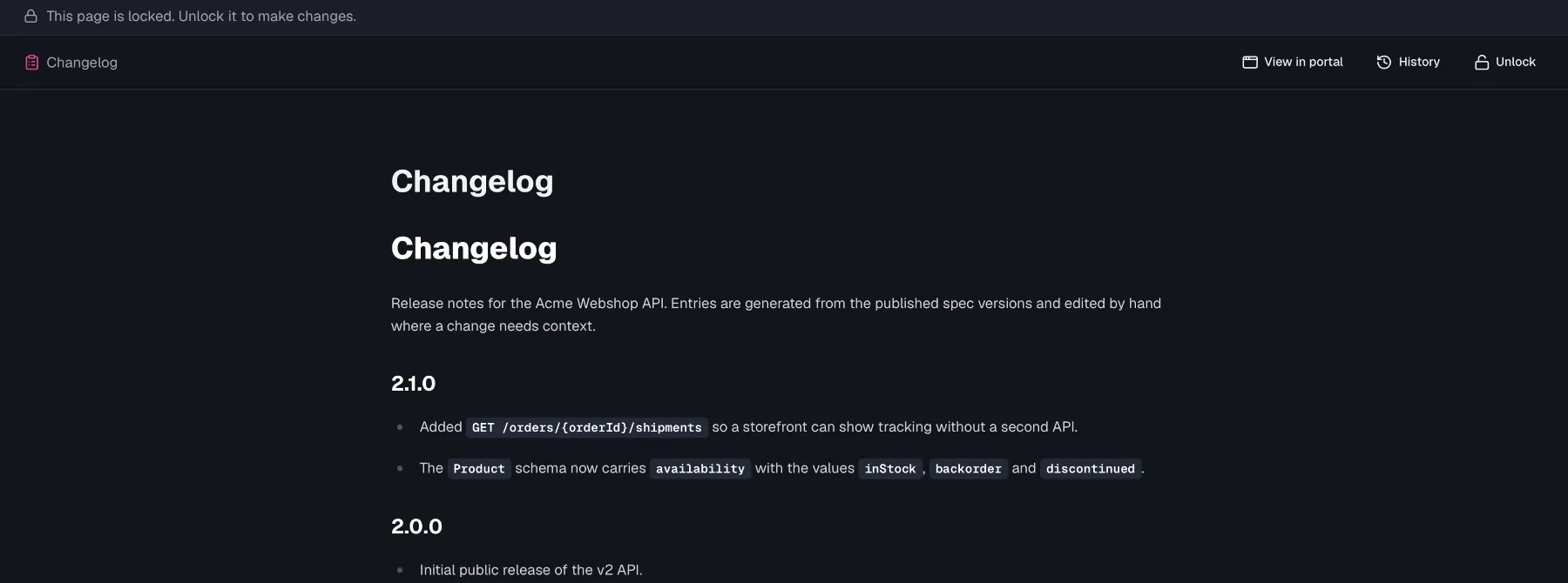
Anyone with docs:write can click Lock page in the page header. A locked page renders read-only for everyone, with the banner "This page is locked. Unlock it to make changes." The lock is enforced on the server rather than only in the UI. Any content update against a locked page is rejected with a PAGE_LOCKED conflict, so an already-open tab elsewhere cannot write through it either. A pending auto-save is flushed before the lock takes effect, so you never lock away your own last keystrokes. Click Unlock to release it.
Writes from outside your session
A change that arrives from anywhere other than a live co-editing session is not merged into your document. That covers a second browser session, the MCP tools and a restored revision.
- If you have no unsaved edits, the page quietly refreshes to the server version.
- If you do have unsaved edits, an amber banner reads "{Name} updated this page. You have unsaved changes." and offers two choices. Reload takes the server version and discards yours. Keep My Changes dismisses the banner and keeps yours, and from then on last write wins, so your next save overwrites the other version.
Neither path merges the two texts. If a page matters and several people are working near it, lock it rather than relying on the banner.
Page history
History in the page header opens the page's revision list. Each revision is a snapshot of the page as it stood before an editing burst, so there is always a point to fall back to.
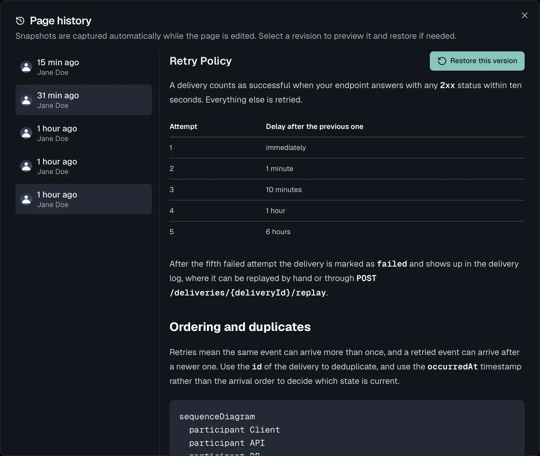
- A revision is captured before each edit burst. Consecutive edits by the same person within 10 minutes share one revision, so auto-save does not flood the list. A restore always captures the pre-restore state first, whoever triggers it.
- Routebase keeps the 50 most recent revisions per page, and older ones are pruned automatically.
- Each entry shows who made it and when. Selecting one renders that revision in full on the right, and Restore this version puts it back into the page. That needs docs:write, an editable version and an unlocked page.
There is no diff view here, because the history shows each revision as a complete page rather than as a set of changes against the previous one. To compare, open two revisions in turn.
Read-only pages
Pages in a Live or Archived version show a read-only banner and render in reader view. Members with docs:write can edit pages in Draft and In Review versions, and without it all versions open read-only.
Related
- Documentation Overview — pages, folders, and the content tree
- Page Templates — starting points for every page type
- Changelog — generating changelog entries from spec changes
- Versioning — why some versions are read-only